
 @natematias
 @natematias
Dataviz: MIT Media Lab Mailing Lists
Published:
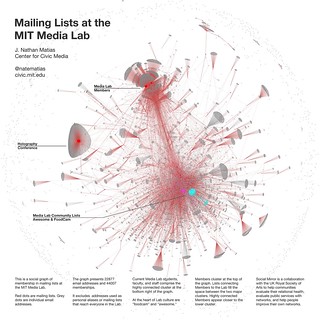
As a fun exercise, I recently mapped out the graph of mailing list membership at the MIT Media Lab, where I am a research assistant. After I filtered out the tiniest lists, the graph contains 23372 email addresses and 44109 edges. Red dots are mailing lists. Grey dots are individual email addresses.
The overall graph shows several distinct patterns:
- The large amorphous cluster on the right is comprised of MIT Media Lab faculty, staff, and students.
- On the left are email lists used for sponsor relations. Almost all of the emails in the leftmost cluster include representatives of the companies we work with.
- The beautiful cluster at the top is a conference, the International Symposium on Display Holography, which is being managed with an MIT Media Lab mailing list. Like the parachute-like clusters, it's a mailing list whose participants are mostly outside the lab. </ul>
Explore further: